My 2 Cents: The Thinking Behind The State’s New Brand
After a week of criticism, including in My 2 Cents and YOUR 2 Cents, the Lt. Governor requested a sit down here at the station to explain the thinking behind Oklahoma's new brand. He acknowledged that the backlash over the new brand caught them by surprisMonday, February 24th 2020, 11:38 pm
After a week of criticism, including in My 2 Cents and YOUR 2 Cents, the Lt. Governor requested a sit down here at the station to explain the thinking behind Oklahoma's new brand.
He acknowledged that the backlash over the new brand caught them by surprise.
He told us there's been confusion about the creators of the new logo, he told us it was designed by a committee of Oklahoma artists led by Sara Sears, and only then farmed out to a Canadian company that specializes in marketing new brands.
I asked a couple of times if anyone stood up and pointed out that the logo doesn't say anything about Oklahoma when you first look at it.
Lt. Governor Pinnell told us oh yes, there was some concern about that, but in the end, it was agreed that Oklahoma's cowboys and Indians and dust bowl image, needed to evolve.
They wanted a new image for Oklahoma more to promote commerce than tourism.
The tag line "Imagine that" sounds sort of canned standing alone, but they are particularly fond of that.
They gave some examples of how it could be used,
I made this one up: Imagine it on an electronic billboard in Kansas "White water rafting on your lunch break? You can in OKC...Imagine That?”
I'm still not crazy about the logo, maybe it will grow on us, I do like the young Lt. Governor's passion for his rebranding mission.
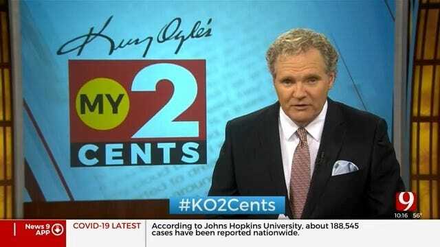
I'm Kelly Ogle and that's My 2 Cents.
More Like This
February 24th, 2020
March 31st, 2020
March 4th, 2020
Top Headlines
November 2nd, 2024
November 2nd, 2024
November 2nd, 2024


